|
1 General overview 1.1 Why technical analysis : the lack of fundamental analysis Technical analysis has a quite different approach to the estimation of buying and selling levels compared with fundamental analysis. Indeed, fundamental analysis, as used by bank analysts (leading to recommendations), mainly relies on financial ratios linked with the company’s fundamentals. Thus, ratios such as stock price on expected earnings, market cap on turnover, debt level, will be studied…. As norms are determined, they enable to determine the risk level associated with an acquisition or a sale of a share. For example, a quite common norm consists in looking mainly for stocks whose stock price / expected earnings per share ratio stands below twenty, which is considered as a major threshold. Similarly, a major level for the market cap / turnover ratio stands around two. Still, this method may lack some elements. Let us take the case of IT stocks at the beginning of the year. Many of these stocks reached a stock price / earnings ratio above 100 and a cap / turnover ratio above 10. From a fundamental point of view, how can we behave? Either we establish new ratios, specific to the “New Economy”, which can take some time, either we stay with the former ratios, which leads to avoiding some good opportunities. Moreover, it often appears that the stock price evolution does not necessarily reflect actual fundamentals of the companies, as over-reaction effects (both on the downside and on the upside) are quite common, especially relatively to announcements. Volver a la parte superior 1.2 Technical analysis in order to take a greater account of psychology For its part, technical analysis comes from a simple financial theory: at a T period of time, a stock price precisely reflects all information available on this stock, all its history. This is due to the fact that time is considered as continuous, as any variation of the price determines a new level, which constitutes a new basis for further variations. It is thus possible to use prices evolution, on different levels, to try to determine further likely evolutions. Still, this identification of variations directions and extents is not self-understanding. Indeed, it becomes quickly obvious that psychological effects (such as threshold effects or the behavior of individuals compared to that of institutional investors) can actually be just as important as pure technical reflections. Thus, opposite opinions can happen on the basis of still similar information. This is even on this very principle that stock prices are determined, as they reproduce a market consensus between buyers and sellers. Thus, technical analysis does not aim, by itself, at determining precise reasons for stocks variations but rather at measuring their evolution and, if possible, at determining their future likely behavior. This approach thus enables to take a greater account of the psychology of operators. Indeed, up and down markets moves are almost always following trends, in short or longer terms. These trends are based on the investors’ approach to the stocks, either pessimistic (bear) or optimistic (bull). The optimism situation is characterized by stock prices always higher even though the fundamentals do not at all justify this rise. Ratios are thus increasing, which can lead analysts to sell the stocks. Still, this is often on such up trends that individuals slowly convince themselves that it may be wise to buy, just as the rise potential is significantly diminished. This observation is an example of the 'sheep like' effect of the markets, and thus the interest of belonging to the first beneficiaries of movements. Volver a la parte superior 1.3 Dow’s analysis and the investors psychology towards announcements Keynes himself asserted in its main book, the Theory of employment, interest and money (1936) that “most investors and professional speculators care less about making precise previsions in the long term than forecasting just before the public the upcoming changes on the conventional evaluation scale”. This approach follows initial Dow’s analysis, the creator of the eponymous index and of the Wall Street Journal. Dow’s theory is a core aspect of technical analysis and is worth developing. Indeed, Dow understood among the firsts the importance of “timing” and reactivity. Its model lies on the idea that, when stocks are heading down, there will always be more aggressive and better informed investors ready to buy stocks in prevision of the recovery (“aggressive buyers”, step "a" in the graph), while individuals are getting rid of their shares. Following this period is the improvement of the company’s results, having investors become more attracted by the stock (“accumulation”, step "b"). This amelioration phase is then likely to put very high buying pressure on individuals, willing to take part in what they consider an everlasting movement. This period is for the first investors an occasion to sell (“distribution”, step "c"), forecasting the upcoming reversing… 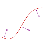
These different analyses come from essential points, which need to be clearly defined. Though every investor conceives the prices up or down concepts, it still needs to be understood how this expresses itself graphically and in prices. For example, an upward trend is characterized by ever-higher lows while a downward trend is characterized by ever-lower highs. This approach of trends can appear trifling but it really is essential to integrate the principles of the technical indicators construction. Volver a la parte superior 1.4 Contrary opinion Right in the continuation of Dow’s theory, Neil (1954) developed the “contrary opinion” principle. This system lies on the idea that, whenever all investors have the same opinion at the same moment, it is very unlikely that this opinion will materialize in facts… This is due to the fact that, if everybody is bullish, who is left to buy? This approach can appear extremely systematic and hazardous but it still stands in the logical continuation of Dow. Indeed, in the theory of this latter, the second period corresponds to a phase of growing confidence in the stock, associated with its acquisition by a growing number of investors. Thus, at the beginning of the third phase, all investors, which are bullish on the stock, have already bought it, while the first “aggressive buyers” are selling. We can then wonder, who will be the buyers enabling the stock to go on with its rise! The market would even have a tendency to fall as the first investors get rid of their shares… So as to estimate sensitive levels, investors use mostly opinion polls related to professionals’ confidence: a very high confidence level is likely to indicate an overbought situation, announcing a reversing on the downside. A symmetric situation could of course be handled on the downside. Volver a la parte superior 2 Technical analysis basis... 2.1 Horizontal resistances and supports The notion of supports and resistances is one of the key points of technical analysis. It is mainly based on the idea that buying and selling decisions are partly due, on both the individual and market levels, to psychological reasons. 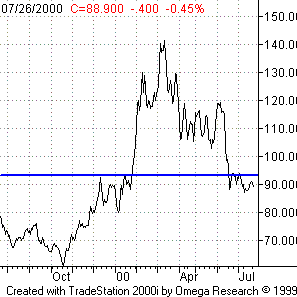
Thus, thresholds effects can be very effective. A level is considered as a support if, every time a stock tries to break this threshold down, the stock does not achieve that and heads back up. If we take the example of Vivendi (cf. graph), we can see that the stock came on the 100 EUR level several times in April and May, therefore 100 can be considered as a support. We also can find psychological levels on the upside, preventing the stock from rising above certain levels: they are then called resistances. We can for example identify a resistance in the 100 EUR area for Casino, as shown opposite. 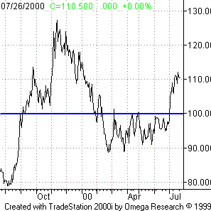
However, these levels, once tested, can be crossed up or down and thus get the opposite function. For example, on the Alcatel stock, the 50 EUR was used to constitute a resistance. Still, it was finally crossed and turned into a support. 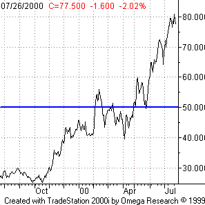
The existence of such figures is also due to the markets memory principle. Indeed, investors remind themselves of previous reversing points and are thus able, when approaching these levels, to act accordingly. These anticipations thus turn , and reinforce the strength of the threshold, support or resistance. In the support case, buyers are the ones recalling the previous situation and winning, while sellers outclass buyers in the resistance case. 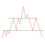
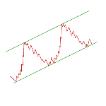
Volver a la parte superior 2.2 Oblique resistances and supports: the basis of trends and channels Though such figures are quite easily recognisable on an horizontal level, since often corresponding to psychological or technical thresholds, this is not the case for oblique supports and resistances, i.e. trend lines. Indeed, it is often possible to have oblique lines appear, on which the stock bumps (resistance) or rebounds (support), as shown by both graphs opposite. The predictive interest of trend lines lies in the ability to thus determine targets on the up and down sides and to optimise one’s timing. It is even possible to identify parallel combinations of these lines, forming channels, heading up or down (cf. graphs). The price thus comes bumping under the upper part of the channel and landing on its lower part. These trends are often extremely strong and express the memory of markets, as channels can be valid simultaneously on the short and long terms. The power of these trends explains that, whenever they come to an end (we say that the channel is “broken”, often down for an upward channel and up for a downward channel), a strong volatility occurs, which can lead the stock to enter a reverse trend. This situation can be preceded by the evolution of the stock in intermediary zones or channels of the channel, thus suggesting that the tendency is about to be invalidated (cf. graph). 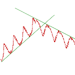
Though it is quite difficult, when there are no obvious signs (horizontal resistance, intermediary channel, …), to forecast the moment the price will exit the channel, it is still possible to estimate the extent of the following move. The occurring principle is simple: just move the channel width where the price exited the channel in the exit direction. 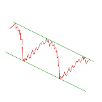
Channels can also be found in a horizontal configuration; then they are called “range”. These figures indicate a little enthusiastic market concerning the variation direction of the stock or the index. 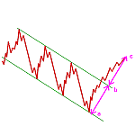
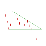
This latter is then evolving around a horizontal mid level. Whenever these ranges are broken (and it is then less obvious to determine the new direction compared to the case of a tendency channel), the target is defined as other channels, by moving the channel width at the exit point in the direction the stock took. Volver a la parte superior 3 Figures 3.1 Consolidation figures Volver a la parte superior 3.1.1 Symmetric triangles Apart from channels, it is important to notice that trend line associations are not necessarily parallel. It is possible to have other significant figures appear, the most common being triangles. These do not constitute trend figures, but consolidation ones. Symmetric triangle figures (cf. graph below) are the most frequently used. They are formed by a downward resistance line and an upward support line. The spot price thus comes bumping against the upper line and landing on the lower line, in smaller and smaller moves due to the crossing of both trend lines. The more often the price comes on both lines, the more valid the figure is (the minimum being of course two impacts so as to determine the lines orientation). 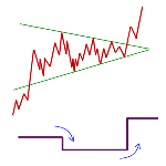
This figure is quite common in the case of long term trends. That is, the exit direction when the figure is broken is in the continuation of the entry direction. This exit normally occurs before the top of the triangle, usually near three quarters of its length (measured from the impact on the second trend line). The form of the figure itself, getting narrower, explains that the power “accumulated” by the stock suddenly appears at the end of the figure, the share moving considerably, often with much higher volumes. With this formation too, it is possible to determine targets. Indeed, it is often standing, in the case of an upward consolidation, on the parallel line to the support line going through the first impact point (resistance line). Another target corresponds to the triangle height used at the exit point. In both cases, this level has to be reached before the date corresponding to the top of the triangle (cf. graph) 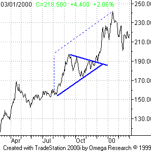
Volver a la parte superior 3.1.2 Flag Another consolidation form exists, under the form of a channel, called flag. It corresponds to a slightly decreasing channel (in the case of an upward trend) or a slightly increasing channel (in the case of a downward trend). In terms of targets, this figure often occurs in the middle of a trend, which means that one can move the height of the segment preceding the flag to the exit of the figure. 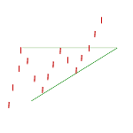
Volver a la parte superior 3.2 Formal figures Volver a la parte superior 3.2.1 Double tops and double bottoms The preceding figures are all related to trend lines so as to delimit them. Still, other figures exist, called formal figures, which are defined by their sole appearance. 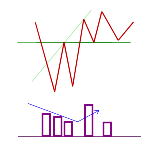
They then are reversal figures: the stock trend is reversing on these levels. The most significant of these figures is the double top (on the upside) and the double bottom (on the downside). As shown below, these formations correspond to two consecutive tops (or bottoms). 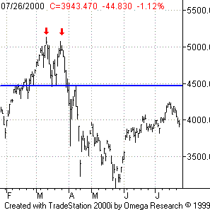
These figures are often characterized by lower volumes during the second extreme, showing the decreasing interest of investors and the expectation of a trend reversal. In terms of target, it can be found by moving the height of the double top (or bottom) figure itself at the level of the end of the figure (cf. graph). 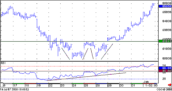
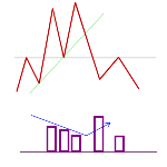
Volver a la parte superior 3.2.2 Head-and-shoulders From this figure head-and-shoulders is derived. This expression comes from the form of the figure, showing three consecutive tops, the first one and the third one being of the same height while the second one is higher (cf. graph). The main element of this figure is what is called “neckline”, corresponding to a horizontal line joining the low points of the second top. Indeed, this figures often characterizes a trend reversal. Up to the second top (head), the stock is standing on a bullish trend, which is broken down by drawing the second shoulder. It then reaches a downward trend, which is confirmed by the crossing down of the neckline after the second shoulder. 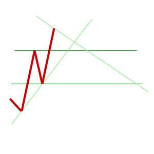
Still, one can often have a phenomenon called “pull back”, corresponding to a return of the price right under the neckline. This return often corresponds to a technical rebound, as it often occurs in low volumes. More precisely, the appearance of the top (head) can be forecasted whenever volumes significantly fall, standing at a lower level compared to volumes reached during the first shoulder. In terms of target, it is calculated just as the double top, by moving the figure height (head height relatively to the neckline) at the end of the figure (crossing down of the neckline). Of course, a symmetric figure can be drawn on the downside. It is then called reverse head-and-shoulders. 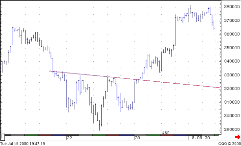
Volver a la parte superior 4 FIBONACCI : a leading indicator This name refers to a set of mathematical and graphical considerations, based on the eponymous series. This latter, formalised by the famous 13th century Italian mathematician, is expressed as: the sum of the two preceding terms (i.e. Un+2 = Un+1 + Un), with the first two terms being 1 and 1 (i.e. U0 = U1 = 1). The first terms of the series are thus: 1, 1, 2, 3, 5, 8, 13, 21, 34, 55, … This series has very numerous interesting properties, the most useful being the limit of two consecutive terms of this series. Indeed, the Un+1/Un ratio aims at the golden ratio (about 0.618) for n infinitely high. In the field of finance, this ratio and its fractions are used to determine resistance and support levels as well as targets. The main proportions used are 38.2 %, 50 % and 61.8 %. They are used to determine what is called “retracements”. Let us take the example of a stock, which following the announcement of good news or a speculation wave, rises from 100 (the level around which it usually evolves) to 300 in a few weeks. If a decrease occurs from the 300 level, corresponding to profit taking or the awareness of the excess of the increase, it can be interesting to measure the extent of this correction before a new upward move, or at least a rebound or the end of the bearish trend, occurs. 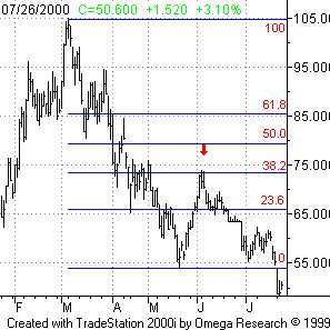
In this case, we can expect the stock to find a support after having dropped by 38.2 % of the upward move. This latter representing 300-100 = 200, the fall extent is 0.382 x 200 = 76.4. A support could thus appear at 300 – 76.4 = 223.6. The most confident investors could thus buy the stock on this level. Of course, a similar analysis could be done in the case of a fall corrected by an upward move. Quite often, the levels determined by these ratios also correspond to supports or resistances, which get stronger as time goes by. Apart from the role of corrections target, Fibonacci ratios can also constitute thresholds, encouraging the sale of one’s stocks after a sufficiently significant rise. Volver a la parte superior 5 Trend indicators 5.1 Presentation of indicators Technical analysis is composed of two parts: graphical analysis and numerical analysis. The first is essentially based on the simple observation of prices and volumes levels, as well as the existence of characteristic graphical figures. The second one, in comparison, uses mathematical constructions. On the basis of prices (especially closing and extreme levels), technical indicators are created. These latter can belong to two categories, referring to both facets of the investors’ psychology. These are trend indicators, usually based on averages, on the one hand and counter-trends indicators, usually based on derivatives, on the other hand. The main interest of technical indicators is their predictive capacity, while graphical analysis often has this possibility only when figures are at least partially drawn. This is especially true for counter-trend models. Volver a la parte superior 5.2 Usefull indicators Volver a la parte superior 5.2.1 Moving averages The most simple trend indicators are moving averages. They simply correspond to an average calculated on an evolving time scale: every day, the oldest value (often taken at the close) in the average calculus is replaced by the value of the new session. 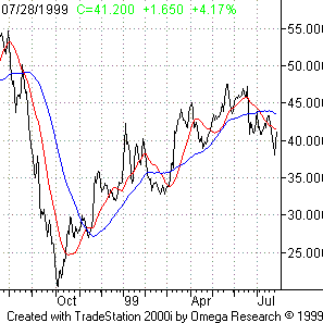
Consequently, the predictive interest of this indicator is nil (since it represents prices evolution with a certain delay). Still, it enables one to determine trends of mid or long term, stronger and stronger as the average direction is steady. In spite of the simplicity of this indicator, the length of averages used should be handled with caution. Indeed, analysts prefer using two moving averages simultaneously, with quite different lengths to forecast possible trend reversals. Thus, one will often jointly use moving averages calculated on 20 and 50 days, or on 50 and 100 days… In particular, this simultaneous use makes it possible to determine buying signals. These occur whenever a short term moving average (e.g. 20 days) crosses a longer term moving average (e.g. 50 days) coming from beneath and thus comes above. This expresses the tendency of the stock to have its most recent prices at a level higher than older prices, thus showing a bullish trend. Reciprocally, a selling signal occurs whenever a short term moving average crosses down (i.e. from above) a longer term moving average and thus comes beneath. Overall, the interest of moving averages is to avoid going against the market trend when it follows a strong move. Volver a la parte superior 5.2.2 Bollinger bands These indicators are derived from moving averages and aim at filling in an important gap. Indeed, moving averages give buying and selling signals at punctual levels, which can thus quickly be invalidated should the market reverse on the very short term (during the session or from a session to another). 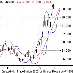
It can thus be wise, rather than defining precise thresholds, to use zones defined as intervals on both sides of the moving average. Bollinger bands are built on this very principle. This figure is composed of three trend lines: the middle, upper and lower bands. The middle band corresponds to a simple moving average, often calculated on 20 days. The level of the upper band, in every point, corresponds to the sum of the level of the middle band and twice the value of the standard deviation associated to the moving average. Reciprocally, the level of the lower band corresponds to the level of the middle band diminished by twice the value of the standard deviation associated to the moving average. An envelop of the stock price is thus determined. This makes it possible to then identify the variation margin in which the stock should stay almost systematically. In the case of a stock following a Gauss law, 95 % of the trades will thus occur between these bands. These latter then constitute very strong support (lower band) and resistance (upper band) levels. These levels respectively represent interesting buying and selling levels, particularly when no real trend appears on the market (and bands are thus stable on both sides of the average), which enables to play with a trading target (short term target). In opposition, in a trend market, clues given by bands are related to their spread. Indeed, a growing spread of bands means a growing standard deviation, which is the sign of the beginning a strong trend. Then, when bands narrow, variations on both sides of the moving average get smaller, which suggests the end of a trend. It is then possible to use bands as supports and resistances. Volver a la parte superior 5.2.3 The MACD One of the most commonly studied technical indicators is the MACD. This indicator (Moving Average Convergence / Divergence) reflects a difference between moving averages and refers to the ascendancy or not of the mid-term relative to the short term. The considered average lengths are respectively 26 days (0.075 exponential coefficient) and 12 days (exponential coefficient of 0.15). Moreover, to estimate the variations of the trend, an auxiliary indicator (named signal line) is formed. It is based on a new exponential average on 9 days (0.20 coefficient). The advantage of this indicator is triple: absolute position of the MACD, relative position to its signal line and existence of divergences. From the first point of view, oversold and overbought situations can be identified. Thus, a strong rise of the MACD indicates that the 12-day moving average is more rapidly rising than the 26-day one, thus showing a stronger volatility in the short term. Then, the crossing of the zero level should be considered with special caution. From the second point of view, one of the most relevant invitations to buy is the crossing up of the signal line by the MACD, especially when it occurs on up reversing levels for the MACD (cf. graph). From the third point of view, divergences can be identified between the MACD trend and that of the stock price on a given period. This phenomenon is marked by the more than proportional increase or decrease of the MACD compared to the stock variation (cf. graph). 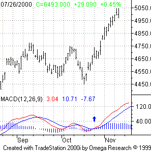
Volver a la parte superior 5.2.4 The DMI As opposed to other indicators, the DMI (Directional Movement index) does not aim at defining excesses (oversold / overbought areas) or divergences but rather at determining trends, used to identify buy and sell signals. It is much more complex to form than other oscillators. First, pressure indicators to buy (+DM) and sell (-DM) are identified. These pressures are then expressed as a percentage of the maximum variation of the market on the period, and a moving average of these indicators is calculated, respectively +DMI and –DMI. 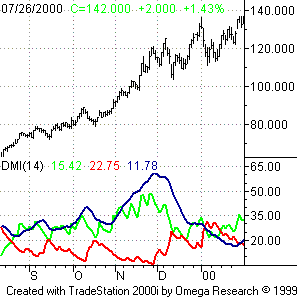
Let us take the example of a 14-day period, with +DMI14 = 0.2 and –DMI = 0.36. This means that 20 % of the market range in the past 14 days was done on the upside and 36 % on the downside. On this range, 56 % (0.2 + 0.36) was directional. Thus, the more directional the market (on the upside AND on the downside), the greater the sum of the DMIs (DMI sum). Still, the difference between +DMI and –DMI is more often calculated (DI diff). The information given on the trend is then different: the higher this difference, the more directional the market in the same direction. The DI diff / Di sum ratio, expressed as a percentage, then gives DX, which is smoothened on the period (often 14 days) to form ADX. Once these oscillators are built, it becomes quite easy to use them. First, one can compare the respective positions of +DMI and –DMI. If +DMI stands above –DMI, the trend on the upside is strong, which means that buyers win more and more. In opposition, if +DMI stands under – DMI, this is the trend on the downside which is strong, and the sellers then become the winners. Moreover, signals are also given by the ADX. As this latter bypasses 17, the market is considered as following a trend. It is then possible to buy (+DMI above –DMI) or sell (-DMI above +DMI). Finally, the ADX enables one, along with moving averages, to determine the validity of the latter. Indeed, as moving averages sometimes have false signals, it is possible to buy only when the ADX shows a trend, and then to follow signals given by moving averages. Volver a la parte superior 6 Counter-trend indicators 6.1 Presentation These indicators are numerous but only a few of them are commonly referred to. They correspond to the graphical representation of mathematical calculations. The latter represents the prices evolution, not their absolute level. They are called oscillators, as they correspond to an estimate of market tensions and behave like a derivative function. This aspect is crucial in order to understand the representation principle of oscillators. For example, a technical indicator reversing up, getting in an up move after having been heading downward, expresses the beginning of an upward trend on the stock to which it is related. Symmetrically, this is the same on the downside. The crossing of a mid-level by indicators thus expresses a move power at its climax letting expect a lower trend pace ahead of a reversal. Volver a la parte superior 6.2 Oversold / overbought levels The first interest of oscillators, linked to their tension indicator status, is to mark sensitive levels, forecasting possible reversals. It is for this reason that the “overbought” and “oversold” concepts have been set up. These levels correspond to market excesses. For example, in the case of an overbought situation, the stock rose steadily without consolidating or correcting significantly, thus letting expect a forthcoming reversal. This is expressed by the oscillator at a high level, in a zone, which has been defined as oversold area and which shows the existing tension on the market. This is also the case, symmetrically, on the downside while, between both extremities, the market is considered as neutral. Still, reading these overbought and oversold zones can be more complex. Indeed, oscillators can take two different forms, with or without boundaries. Indicators with boundaries evolve between two fixed limits (often 0 and 100). It is then easy to determine these zones (for example above 75 for overbought and below 25 for oversold). In comparison, indicators without boundaries, by definition, have no theoretical limits on the upside and on the downside, which makes it more difficult to set up such zones. However, though it is careless to buy in an already overbought market, the sole analysis of the indicator level does not necessarily give all information (see graph). Volver a la parte superior 6.3 Divergences The main analysis element of indicators, though often underestimated, lies in the divergences principle. This corresponds to a disconnection between the prices evolution and that of the indicator (cf. graph). One will thus consider a downward (upward) divergence when the oscillator is following a downward (upward) trend while prices are still rising (falling). This phenomenon is directly linked to the derived function status of indicators. Indeed, a decrease of the indicator while prices are rising indicates that this rise is pursuing at a lower pace. This breathlessness of the market then lets expect a reversal on the downside. Still, this approach is valid only when linked to the preceding aspect, i.e. the presence of the oscillator in an oversold or overbought area. Indeed, these zones are the predilection place for trend reversals, as they mark an uninterrupted trend. In comparison, a neutrality (cf. graph) of markets makes breathlessness quite unlikely and thus little relevance to the analysis of divergences. Moreover, as divergences are premonitory signs, it is often careless to act in consequence just after the apparition of divergences. It is then much safer to check whether they are validated or not, i.e. if the indicator can rebound on the overbought or on the oversold line (cf. graph). 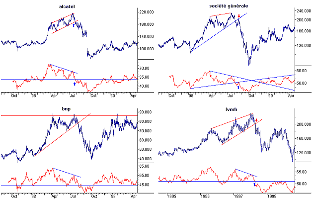
Volver a la parte superior 6.4 Graphical figures Beyond calculations on indicators, this latter can also provide information by themselves, just as stock prices. Trends and figures can thus be identified. Indicators can also bump under resistances or land on supports. This aspect is also interesting as trend ruptures on oscillators often precede that on stock prices. Within this framework, the neutrality zone (corresponding to the middle of the boundaries for indicators with boundaries) is especially overseen, as it often constitutes a major support or resistance. Moreover, it is possible to use filters. For example, it is often wise to compare oscillators with their moving average on a certain number of days to eliminate punctual and non-significant variations. It then becomes possible to set up a systematic method, based on the fundamental principle of indicators: not going against the trend. This rule consists in buying as the oscillator breaks up the zero level, while it stands above its moving average, and to sell as this level is crossed down, with the indicators turning around and crossing down the zero level. This set of counter-trend indicators is based on a simple observation: when stock prices stand in a bullish trend, closes stand at higher and higher levels from day to day while, when stock prices stand in a bearish trend, closes stand at lower and lower levels. Combining both conclusions, it becomes possible to forecast reversals as soon as new tops appear but with closes on the downside. Volver a la parte superior 6.5 The RSI This indicator (aka Relative Strength Index) aims at establishing a reference scale independently from the stock prices levels themselves. As the RSI has boundaries (0 and 100), it then becomes very easy to determine overbought and oversold areas. Thus, the RSI is one of the most commonly used counter-trend indicators. It is based on the average of rises and drops of a stock, with the formula : RSI = 100 – [100 / (1 + RS)] where RS represents the average of up closes divided by the average of down closes on the considered period. Consequently, the shorter the studied period, the more volatile the RSI. Depending on trading habits, longer or shorter lengths can thus be used but the most common length is 14 days. On a graph, lines can be drawn at 30 and 70. A crossing down of 30 indicates that the market is oversold while a crossing up of 70 indicates that the market is overbought. Just as for the MACD, it is possible to smooth signs given by the RSI by forming two RSI on two different periods. Then, a crossing up of the long-term RSI by the short-term RSI constitutes a buying signal while a crossing down of the long-term RSI by the short-term RSI constitutes a selling signal. The principle of divergences is also applicable to the RSI, and is more easily applicable than on the MACD, as overbought and oversold areas can legitimately be drawn. Finally, just as on stock prices themselves, supports and resistances can appear, especially when nearing the neutrality zone (near 50). 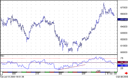
Volver a la parte superior 6.6 Stochastic Oscillator (by METASTOCK) The Stochastic Oscillator compares where a security's price closed relative to its trading range over the last x-time periods. The formula for the %K parameter of the Stochastic is : %K = 100 x [ (C – Lx) / (Hx – Lx) ] For example, to calculate a 10-day %K: First, find the security's highest high and lowest low over the last 10 days. For this example, let's assume that during the last 10 days the highest high was 46 and the lowest low was 38--a range of 8 points. If today's closing price was 41, %K would be calculated as : The 0.375 in this example shows that today's close was at the level of 37.5% relative to the security's trading range over the last 10 days. If today's close was 42, the Stochastic Oscillator would be 0.50. The 0.50 would show that the security closed today at 50%, or the mid-point, of its 10-day trading range. The above example used a %K Slowing Period of 1-day (no slowing). If you enter a value greater than one, MetaStock will average the highest high and the lowest low over the number of %K Slowing Periods before performing the division. A moving average of %K is then calculated using the number of time periods you specified in the %D Periods. This moving average is called %D. Finally, MetaStock multiplies all stochastic values by 100 to change decimal values into percentages for better scaling (e.g., 0.375 is displayed as 37.5%). The Stochastic Oscillator always ranges between 0% and 100%. A reading of 0% shows that the security's close was the lowest price that the security has traded during the preceding x-time periods. A reading of 100% shows that the security's close was the highest price that the security has traded during the preceding x -time periods. Stochastic Oscillators can be used as both short- and intermediate-term trading oscillators depending on the number of time periods used when calculating the oscillator. When displaying a short term Stochastic Oscillator (e.g., 5-25 days), it is popular to slow the %K value by 3-days. There are several ways to interpret a Stochastic Oscillator. Three popular methods include : -- Buy when the Oscillator (either %K or %D) falls below a specific level (e.g., 20) and then rises above that level, and sell when the Oscillator rises above a specific level (e.g., 80) and then falls below that level. However, before basing any trade off of strict overbought/oversold levels it is recommended that you first qualify the trend of the market using indicators such as r2 (see r2) or CMO (see Chande Momentum Oscillator). If these indicators suggest a non-trending market, then trades based on strict overbought/oversold levels should produce the best results. If a trending market is suggested, then you can use the oscillator to enter trades in the direction of the trend. -- Buy when the %K line rises above the %D (dotted) line and sell when the %K line falls below the %D line. -- Look for divergences. For example, where prices are making a series of new highs and the Stochastic Oscillator is failing to surpass its previous highs. The constitution of these indicators is more complex than that of other oscillators. A first oscillator, called %K, is constituted, with the formula : %K = 100 x [(C – Lx) / (Hx – Lx)] where C represents the last close price, Lx the lowest price on the past x days and Hx the highest price in the past x days. The most common length used is five days. Thus, when the market stands on its highs, the closing price is close to its tops of the last few days. The ratio then tends towards 1 and the %K oscillator towards 100. Oppositely, on the downside, the ratio tends towards 0 and so does %K. %K thus expresses market tensions (oversold or overbought) in the RSI manner but, as opposed to the latter, is related to extreme prices and not close prices. A second indicator, %D, is then constituted, so as to smooth %K, with the formula : %D = 100 x Hy /Ly where Hy represents the sum of (C – Lx) on the past y days and Ly the sum of (Hx – Lx) on the past y days, with y < x. In other words, %D is an average of %K (x days) expressed on the past y days. This new length is often three days. In spite of this smoothing, it remains difficult to compare %D and %K as %K can easily come from 0 to 100 from a session to another. Then, %D becomes the new reference indicator. A third indicator, slow %D, is then created so as to smooth %D. This indicator is formed by taking the average of %D on three days. %D and slow %D are then respectively called fast and slow stochastics. 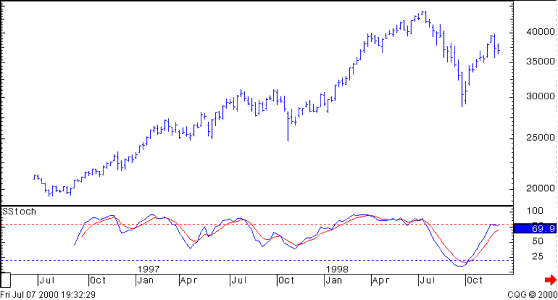
Stochastics can be used in different ways. First, the presence of the fast stochastic on extremes (near 0 or 100) indicates oversold or overbought situations. Despite the smoothing of %K by %D, this indicator remains volatile, which makes it difficult to use in this framework. Reciprocally, this strong volatility makes it possible to consider that, if %D remains on high (resp. low levels) for a long time, stock prices are standing on a strongly rising (resp. falling) trend. Moreover, buying (resp. selling) signals occur when the slow stochastic stands on low (resp. high) levels and crosses up (resp. down) the slow stochastic. Finally, as for the other indicators with boundaries, divergences between the oscillator evolution and that of stock prices can occur. 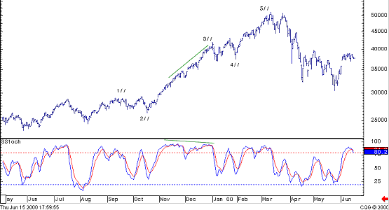
Volver a la parte superior
|


